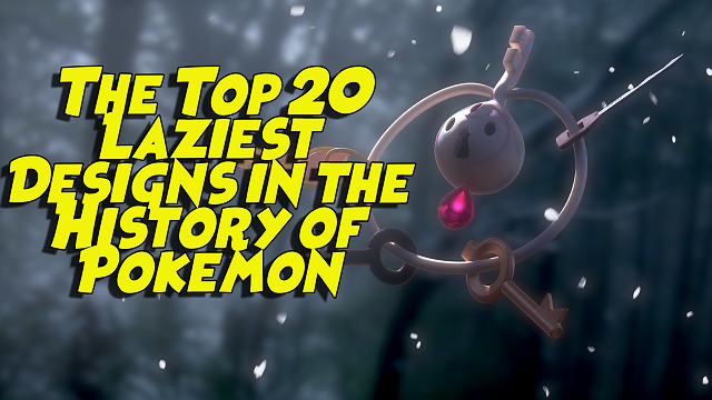
Pokemon has been around for over 20 years and considering there are now well over 700 different species of Pokemon, it's shocking how diverse and creative some of the designs are.
However, today I'll be breaking down the top 20 laziest designed Pokemon from passable to worst. Everything from Pikachu knock offs, to inanimate objects seemingly just being turned into Pokemon, to just straight up a pile of garbage.
#20 - Dedenne
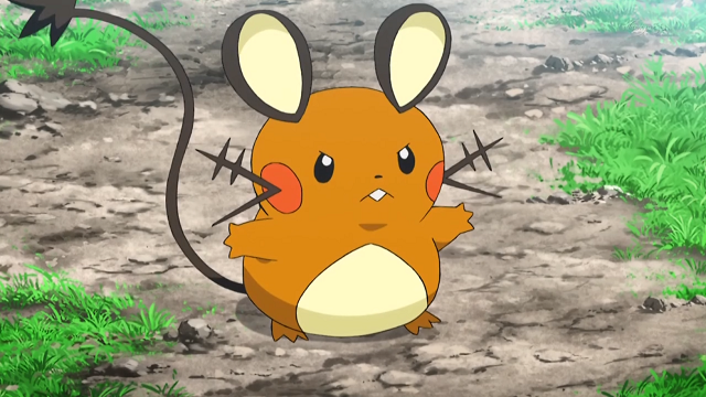
Kicking things off fresh and new with a sixth generation Pokemon, Dedenne is absolutely once again another Pikachu knock-off -- yet still no where near as interesting.
 From the orange brownish colour pallet, thin mouse-like tail, and the inclusion of whiskers he just comes off looking like a Pikachu and a Rattata had a one night stand and this was the end result once the egg hatched. (Maybe that's what actually happened?)
#19 - Spoink
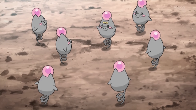
Ah yes, Spoink! Literally a pig with a spring tail that it bounces up and down and has a pink orb on its head, it's as lazy as is it cute -- very.

Sadly Spoink's design is just kind of bad over all. The spring tail is a novel idea, but everything from the lack of a mouth and feet, to those dinky little arms, it just comes off being lazy to me personally. But still a novel idea none the less with the spring tail, hence why it's so high up on this list.
#18 - Noctowl
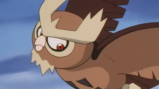
Here is where we start entering the territory of slightly redesigned animals and Noctowl is a prime example of it. From the name simply combining the words nocturnal and owl and to its over all design.
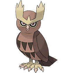
A boring brown colour pallet (no wonder Ashs's was a shiny one) -- Noctowl is the prime example of a straight up real-life bird knock off. But at least he has those cool eye brows to make up for it, hence his placement on this list.
#17 - Wailord
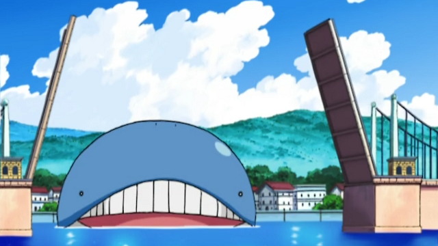
Another example of a slightly re-designed animal concept that the boys over at the Pokemon Company seemed to really latch onto.
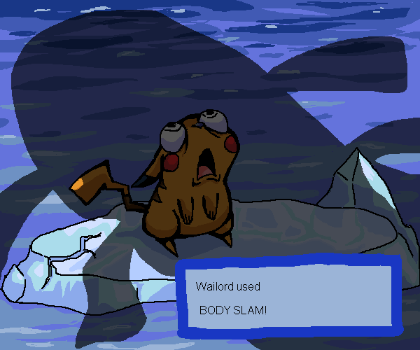
 At least its prior evolution was slightly different by being round, but Wailord itself in terms of overall design was just lazy. Wailord's only notable feature is that it's really big...
#16 - Luvdisc
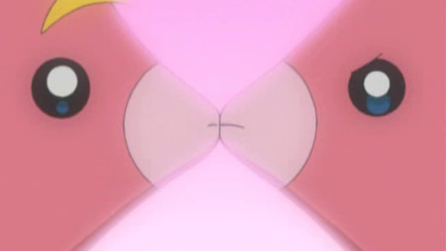
"Hey so we designed this fish shaped like a heart, can we go home now?"
Yeah unfortunately Luvdisc is easily the laziest designed fish Pokemon in the entire series so far, it doesn't even have fins!

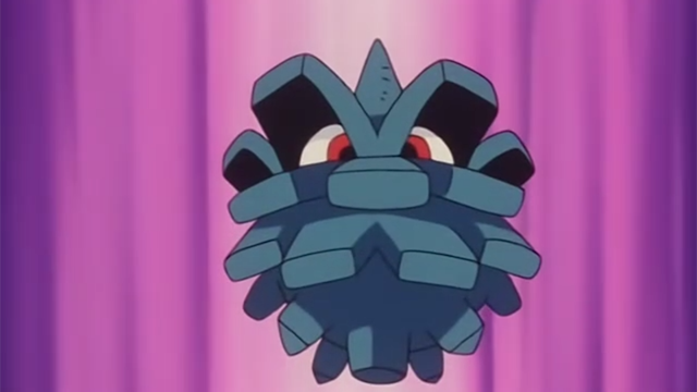
#15 - Pineco
Now we enter the territory of inanimate objects becoming Pokemon, in this case a pine cone...

I know creator Satoshi Tajiri came up with the basic idea and design of Pokemon by catching and collecting bugs when he was a child. But damn his backyard now as an adult must be really boring if all he could think up or find was a pine cone and then slapped some eyes on it and named it Pineco.
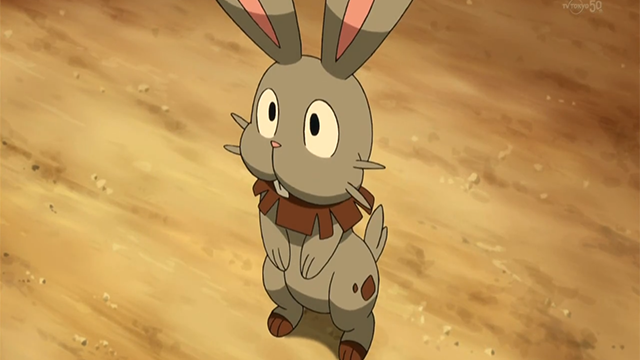
#14 - Bunnelby
Bringing it back to animals -- this Pokemon almost looks like a fan-design, it's just so uninspired in concept.

It's literally just a rabbit, the only remarkably unique thing about it is the ear design, like really? You have this gorgeous 3d environment and designs for your Pokemon in Pokemon X and Y and one of the new Pokemon you add is this? ANOTHER RABBIT DESIGN?
At least it's not another Lopunny.
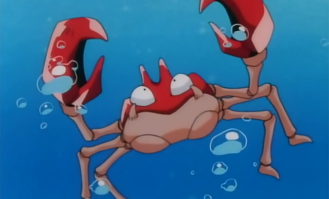
#13 - Krabby
Fun fact, the episode in which Ash caught Krabby was the very first episode of Pokemon I ever watched. So in a weird way he holds a special place in my heart, but I can't deny just how lazy the design concept of Krabby is.
 It's literally just a crab -- named Krabby.
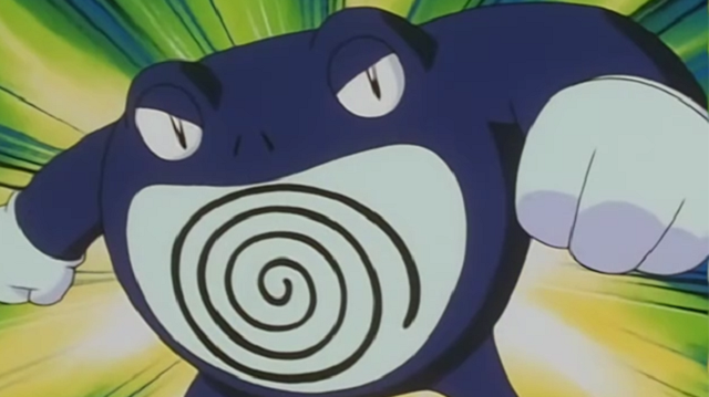
#12 - Poliwrath
 When you take a good look at Poliwag you automatically assume or think "Oh sure a tadpole, I bet its final evolution is a frog or toad" -- well you're not wrong (Politoed) -- but if you decide to give Poliwhirl a water stone instead, you end up with a slightly more angry looking Poliwhirl in the form of Poliwrath...


INCREDIBLE!
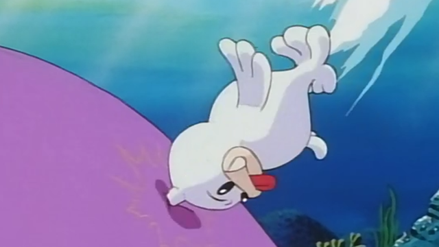
#11 - Seel
&j But did you know? That when it snows my eyes become &k -- Oh wait, wrong Seal. Unfortunately, Seel is nothing more than a seal with a horn on its head. Nobody likes to admit it, but first generation Pokemon had some really questionable designs, we'll be tackling more of them soon enough.
 As a Canadian, I'm not allowed to have a Seel in my Pokemon party.
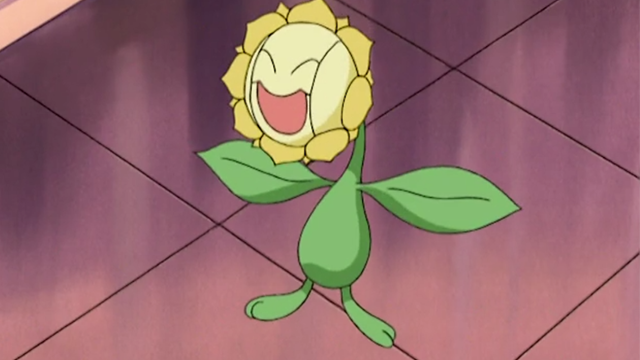
#10 - Sunflora
In my opinion Sunflora is the absolute laziest designed grass type in the entire franchise so far. It's literally just a sunflower with a face on it... I wonder if it has sunflower seeds though?
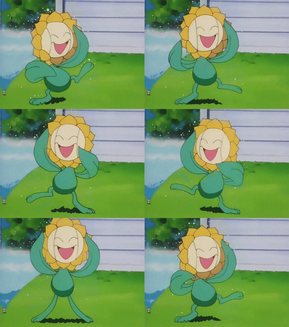 ...And can you eat them?
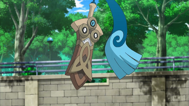
#9 - Honedge
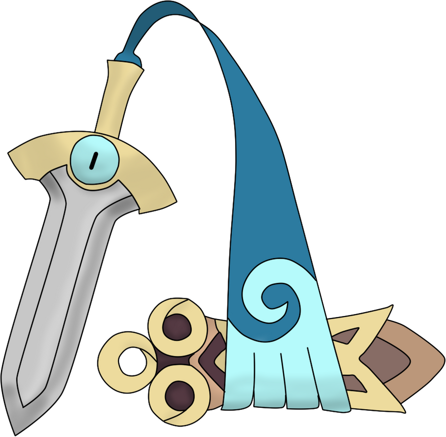
The concept of a Ghost/Steel type Pokemon is really cool, but instead we got a floating sword for a Pokemon. At least the design of the sheath is kind of cool, but the idea of inanimate object becoming a Pokemon always just seems so lazy to me. However it does have the excuse of "it's a ghost though!" -- so I guess it got a pass?
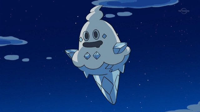
#8 - Vanillish
This Pokemon gets a ton of flack from Pokemon fans for just how uninspired it is. Because once again it is just an inanimate object being turned into a Pokemon, in this case an ice-cream cone.

Not really much else to say, I think it's a step below Honedge simply because it's ice cream instead of a sword.
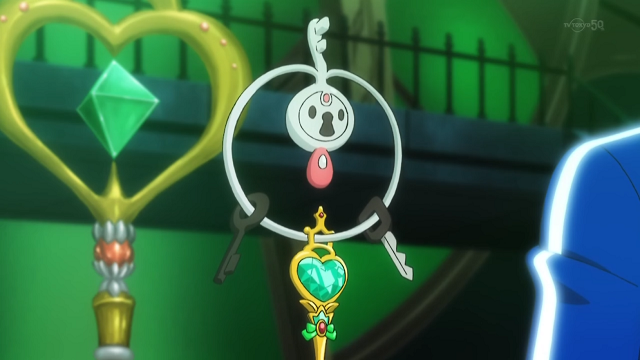
#7 - Klefki
Some designer or artist at the Pokemon Company was parking there car one day, dropped their keys, and suddenly said: "I'VE GOT AN IDEA THAT WILL GET ME OUT OF WORK EARLY TODAY!" -- Then again knowing Japanese worth ethic this is extremely unlikely.
 On the topic of Klefki, once again another example of inanimate objects being turned into Pokemon. It doesn't even have the excuse of being a ghost type either, it's a steel/fairy type!
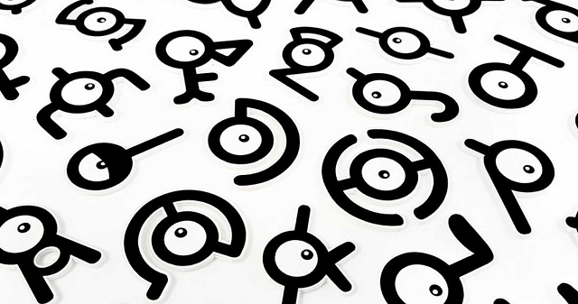
#6 - Unown
If I wanted to be a real ass, I could have made this whole list Unowns! From inanimate objects to basically the English alphabet itself, Unown is possibly one of the oddest designs, but still very uninspired in my opinion.
 I always liked capturing "K" so it seemed like it was partially spelled "Unknown" -- just the K itself was the actual Pokemon, welcome to my brain.
In general it was also a very useless Pokemon, it was basically there for puzzle solving and had no real purpose other than this.
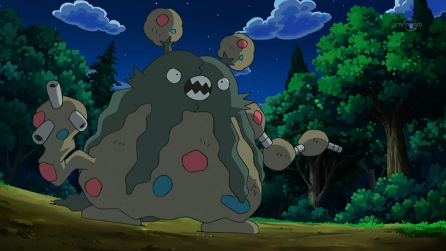
#5 - Garbodor
Garbodor is the biggest offender in my opinion so far in inanimate objects becoming Pokemon, Garbodor is literally just a pile of garbage...
 As I've already mentioned prior, I don't like the idea of inanimate objects becoming Pokemon. So when a pile of trash is one -- I honestly don't see how anyone could genuinely like that Pokemon. But at least they gave it arms and ears... I guess?
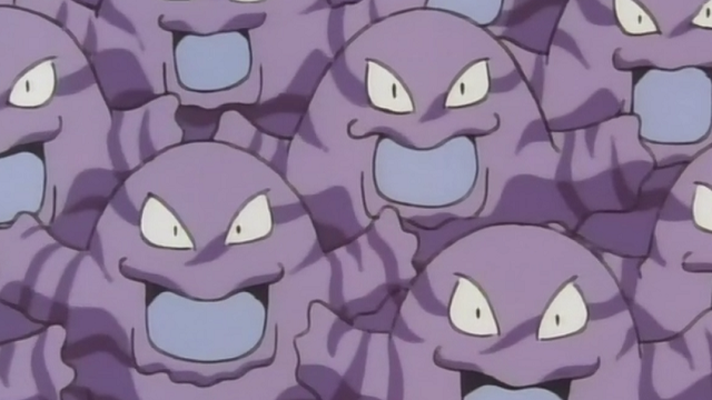
#4 - Grimer
So how do you get worse than a pile of literal trash? A pile of purple ooze! Grimer is basically a pile of toxic waste and clearly nobody wasted time in its design.
 I'd like to imagine if Ivan Ooze was a Pokemon trainer, this is all he would have -- Grimers and Muks!
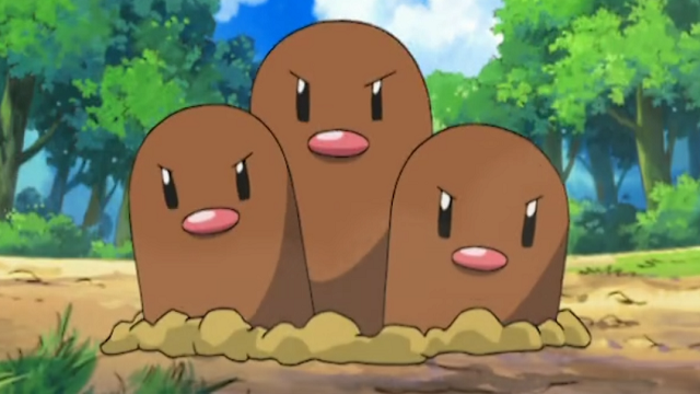
#3 - Dugtrio
One upping Diglett for this list in lazy design, Dugtrio is literally three Digletts but now with angry eyes! Diglett and Dugtrio are so bizarre and simplistic in design, it has left many people wondering what exactly is beneath the ground?
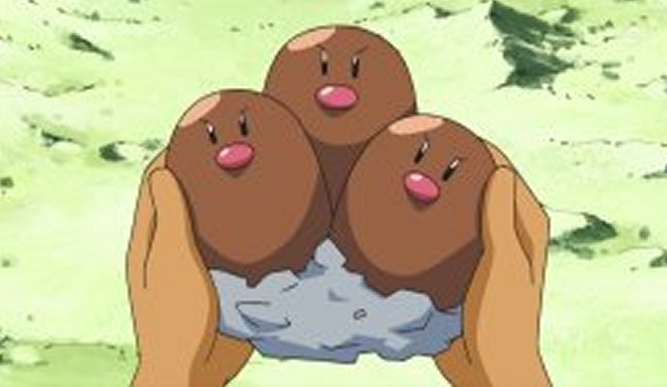
The anime hasn't been able to answer this, but fans have come up with their own theories!
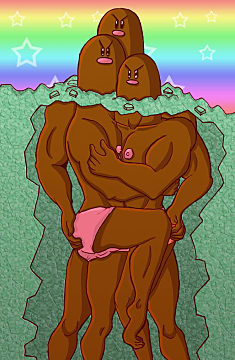
True horror waits below the surface.
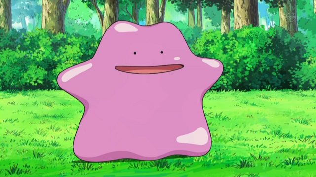
#2 - Ditto
Ditto is simplistic to a whole new level in terms of design, he's literally just a pink blob with a poorly drawn smiley face (at least Grimer had an expression and proper eyes!)
If it weren't for the fact it has an extremely interesting hypothetical history in potentially being a botched Mew clone, which then explains why it can transform and take the shape of any Pokemon, I'd say this is possibly the absolute worst designed Pokemon of all time.

It's so basic in design, I even drew it in MS paint!
But as I mentioned, I hate inanimate objects becoming Pokemon, so the #1 spot is the absolute peak of this...
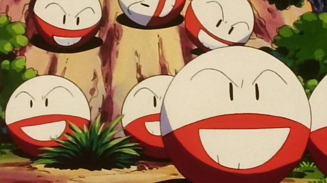
#1 - Electrode
Why not Voltorb you ask? Simple, Voltorb was designed with the gimmick and idea that it basically tricks players into thinking it's a pokeball or item within the game, despite the simple design -- it was intentionally simple. But there is always that benefit of the doubt that perhaps it will evolve into something more complex...

Nope! Instead it evolves into a slightly larger ball that defeats the purpose of its original design by flipping the colours around and giving it a mouth -- FANTASTIC!

The only notable thing about Electrode is that it blows up a lot, hence why it is my personal #1 pick for the most laziest designed Pokemon.
But what are yours? I'd love to know, so comment down below! And for everything Pokemon related, stay tuned to GameSkinny!

Published: Apr 25, 2017 05:43 am