When the first pictures of Civilization 6‘s art style were released, they had mixed reviews, some people disliked it because it looked too ‘cartoony’, while others welcomed it. Civilization 6 brought quite a few mechanical changes, and most of these these required artistic changes. The game’s art style is bright, dynamic, and just what the series needed. Disclaimer: art is of course subjective, so I’ll be discussing the styles themselves and not whether they’re good or bad.
Let’s start with Civilization 4 since previous Civ‘s are quite dated and their 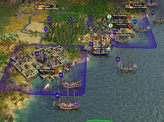 graphics would not hold up to today’s games. Civ 4 still used square tiles, and as such territory borders looked anything but natural (unless maybe if you look at the western US states). The graphics style was meant to look realistic (aside from the rectangular territory borders) and the game itself felt like more of a simulation.
Civilization 5 improved on the graphics. It was the first Civ to use 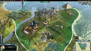 hexagonal tiles so the territory borders looked more natural. This was helped by the engine smoothing corners out. The overall graphics style was not as realistic as Civ 4 — except perhaps for the water, which can generally be attributed to better graphics capabilities rather than art style. One Firaxis developer mentioned in one of their live streams on Twitch, that while Civ IV played more like a simulation, Civ V played more like a board game. Although he was talking more about the mechanics between the two, it could also be applied to the art style.
The art changes between all the previous Civs were purely cosmetic; the graphics engine matched the needs of the game’s mechanics and improved with the capabilities of graphics cards at the time. While the same can be said with Civ 6, the new mechanics, namely unstacked cities, outright required a new art style.
In previous Civs, all cities looked virtually identical (apart from various civilization culture differences). Civ 6 has unstacked cities; what does that mean for the art? The city tile itself doesn’t change much, it is more or less how it’s always been, a generic city for whatever time period you are in at the time. However, each district (the new plots that contain the key buildings your city used to hold) has at least 5 different phases it can be in: under construction, built, 1 building, 2 buildings, 3 buildings, and possibly more. Each different type of district will look different also, each phase of the 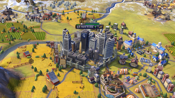 campus for example has to be distinguishable from other phases and also from other districts (holy site, commercial, etc).
All this also with cultural differences — some civs have buildings that only they can build.
Lastly there’s the wonders which also occupy their own tile now, each of those has different art for different phases of construction. Did I mention the (optional) day-night cycle? If you have it turned on, apparent time passes and you can see city lights come on at night; while probably not another style in of itself, nevertheless the artists had to plan for that mechanic also. As a result of all these requirements, the whole style is more bright and vibrant. It may suffer in realism to some degree, but in defense, the Civilization series isn’t meant to be a simulation (and it isn’t marketed that way either).
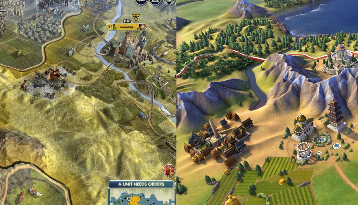
Civilization 6‘s art style contrasts from its predecessors significantly. Granted it was shocking at first, but once you realize the map and its huge array of elements have to be easily read and understood, you realize this bright and dynamic art style is absolutely required. Once you appreciate this, the previous Civ‘s graphics literally pale in comparison. This game’s art style represents what this game brings to the series, both mechanics-wise and art-wise: vibrance.




Published: Oct 26, 2016 10:13 am