If you’ve played an RPG then you know how difficult it can be if the map is terrible. You also know how much fun it can be when you have a map that gives you all the details you need, and none that you don’t.
So let’s first take a look at some great games that are even greater because of their maps.
The Elder Scrolls V: Skyrim
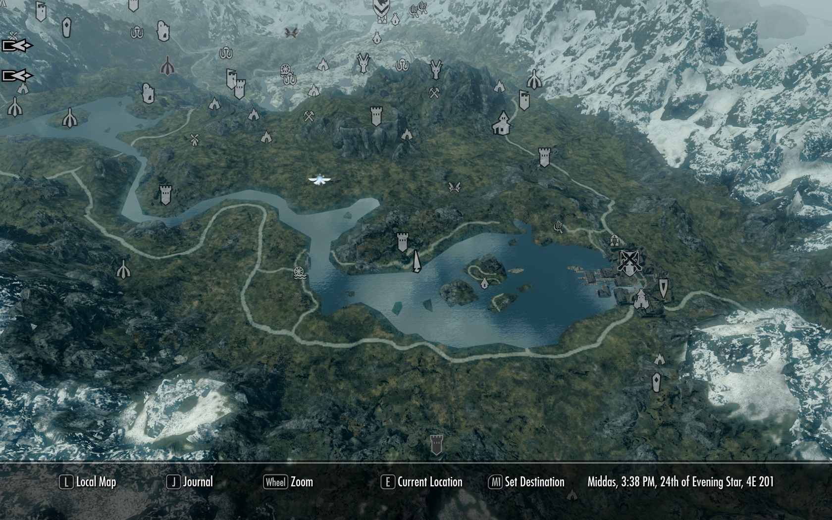
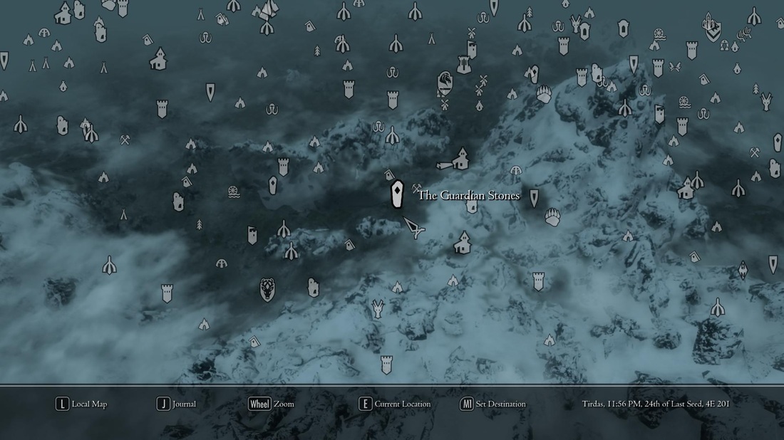
If you look at this map you are instantly drawn into the world. In-game, this map is a 3D isometric view of the world. You get to see how tall the mountain peaks are and how much snow covers each area. Even in the collector’s edition strategy guide map you get a sense of the scale of the world. You’re given so much detail that it just helps you to get into the mindset of “that looks cool, I want to go there.” This is the perfect mindset to be in when playing Skyrim.
If you’ve never sat down to play Skyrim and just picked a point on the map and walked all the way there, then, I dare say, you haven’t played Skyrim. It’s a game that demands the map be so good. Without the intrigue of the map, you’re less likely to wander the world, trying to find out what lies in every nook and cranny. If it were a simple map, with less detail, you may not be as intrigued.
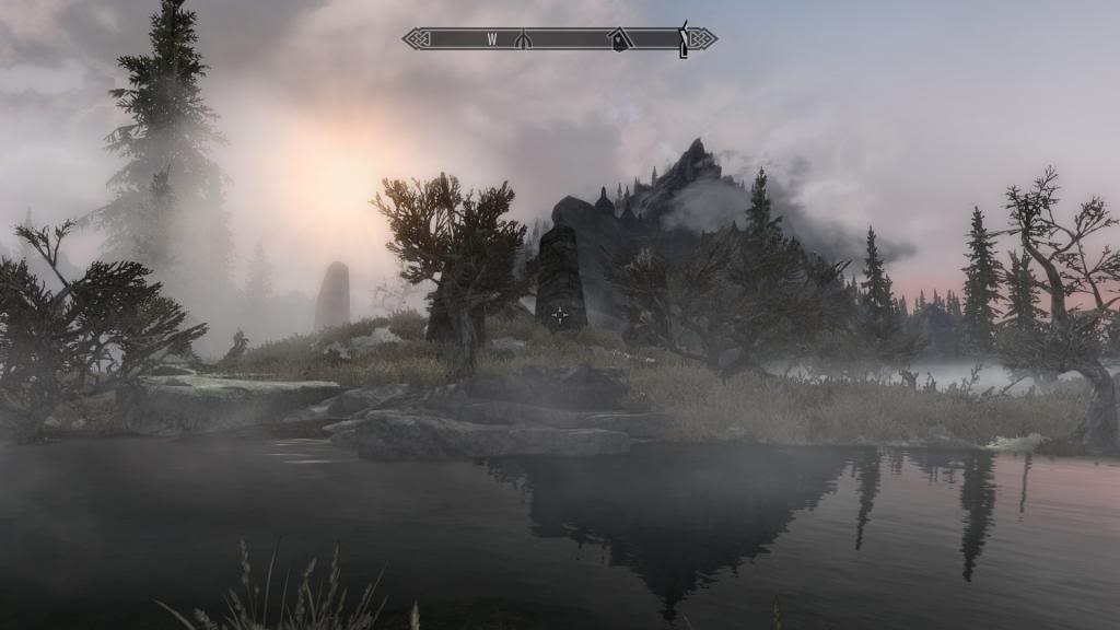
The other smart choice, in regards to the map, is the lack of traditional mini-map. Having just a compass at the top of the screen was a brilliant choice. Showing points of interest within the compass was an even smarter choice. By having a compass instead of a direct, follow this route mini map, gives you even more burning desire to explore the vast world. You see that your goal is in that direction and, if you followed a straight line you would be there in twenty minutes or less, much like a pizza delivery. But thanks to that glorious compass you get distracted and it ends up taking 14 hours to get there instead — that would be one cold pizza.
The Witcher 3: Wild Hunt
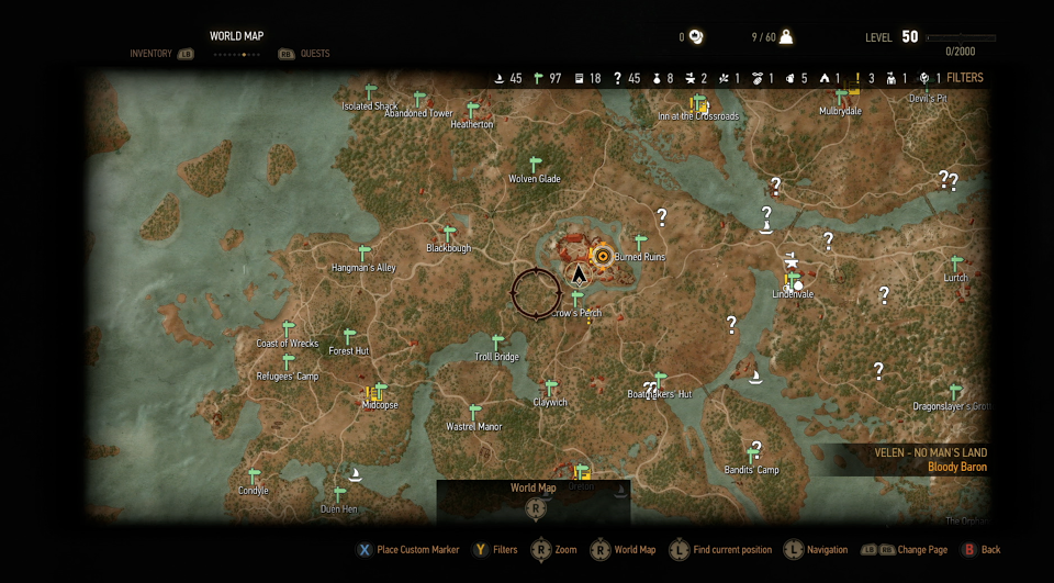
Another game that has a fantastic map that begs to be explored, Witcher 3. While this one doesn’t have the depth of the world, like in Skyrim, you still get a sense of the scale of it all. You still see a point on the map and think, “ooh that place has a lot of houses, I want to go there.”
The subtle use of color to depict forests, and houses, and castles is perfectly balanced to match the world. It feels like you’re sitting down and looking at a hand-drawn depiction as Geralt of Rivia. Every detail in the map makes you want to wander around and see every monster that lurks in the shadows, or under the trees, or in the lakes. Looking at the beautiful map, makes you want to wander until your feet bleed, so to speak.
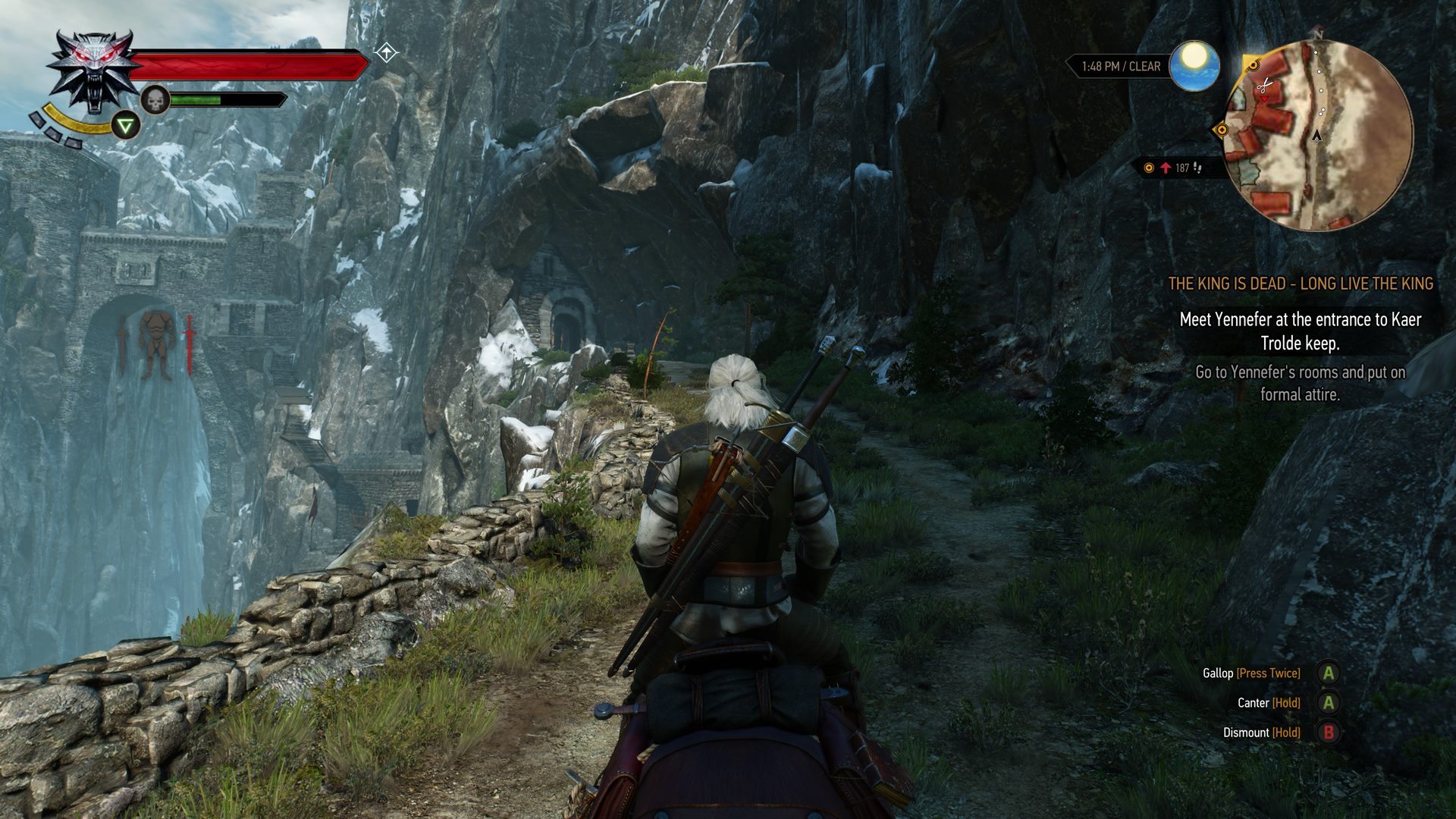
The mini map in Witcher 3 suites the game perfectly. It may be a more traditional mini-map, in that it shows your immediate surroundings, but giving you the direct route allows you to get from point-a to point-b faster. In the world of Witcher this is important because dangerous, higher-than-you level monsters lurk around every corner. By following the paths laid out for you, one can avoid dying a gruesome death because the swing of that basilisk takes out your quen shield before your mana bar has refreshed.
Now, let’s take a look at an example of a bad map.
Dragon Age 2
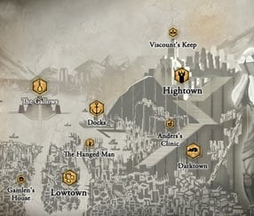
I remember the first time I opened the map up in DA2 and was instantly lost. It took me forever to figure out where I was going. After several hours, I finally got used to it, but man was it awful. Not only that, being a sort of mission-based RPG, it reused the same 15 maps over and over for each act, which got really old really fast.
Not only was the map not interesting, but it didn’t help you figure out where you needed to go at all. You couldn’t tell what elevation level you were on. They tried to account for the elevation by using dotted lines and then having the upper half on a separate page, which meant you had to cycle between levels, if in an open cavern. It was atrocious. Navigating through that game without some other source to help guide you was nearly impossible.
The mini map doesn’t fair much better. It’s a translucent map that hides in the corner and can be made to fit the screen a bit better. It again has issues with showing depth and height. You can’t tell if a section is steps or if it leads to another map, or if it’s a dead end.
As long as game developers can learn from the success of Wild Hunt and Skyrim, and the failure of Dragon Age 2 and others I didn’t mention, then the future of great maps and mini-maps in RPGs is looking up. I’m sure there will be more games that are hindered by poor map design, but hopefully they’ll be few and far-between.
What are games you think succeed in the map and mini-map space? What games do you think failed at it? Let’s discuss in the comments!


Published: Jan 11, 2017 10:05 am