As smartphones continue to become more sophisticated, more mobile games reach online stores and wait eagerly for players to download them. In 2016, the mobile gaming market registered a revenue of $ 2.61 billion in the United States alone, according to Statista.
With relatively low development costs and plenty of money flowing through the industry, mobile gaming has become an attractive opportunity for developers. And one of them is the team titled “Wooosh!”
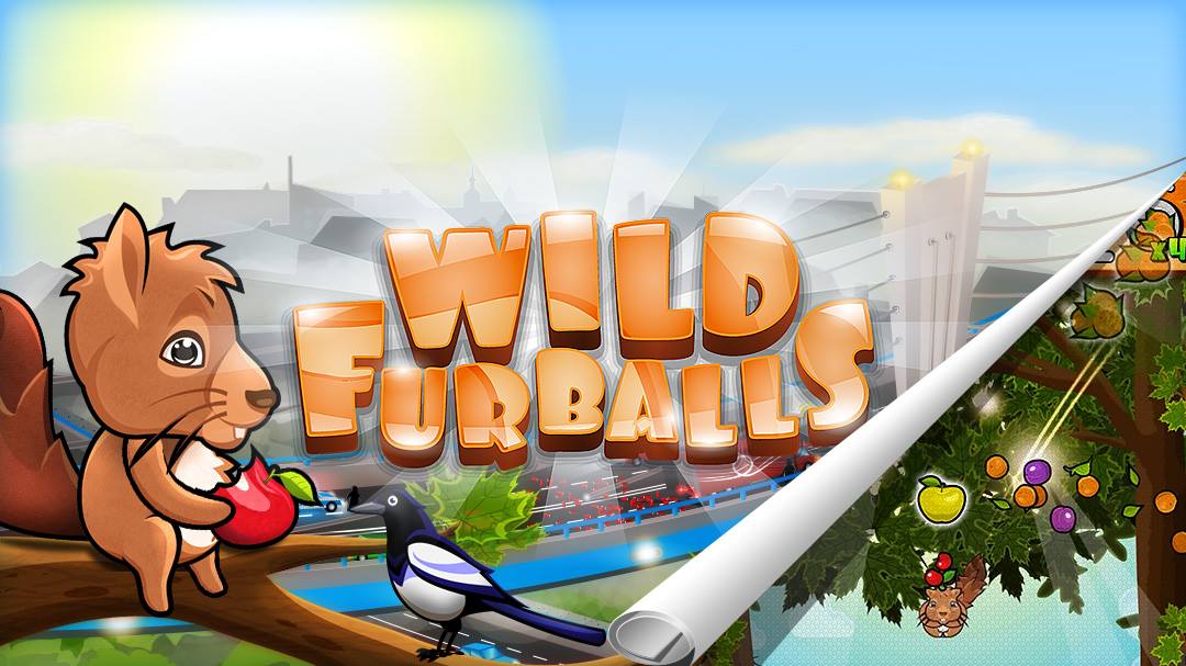
After ten years working with online education and IT systems, they managed to fund their first game project, Wild Furballs: Throw.
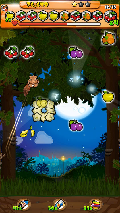
Available for iOS and Android, this game consists of shooting a squirrel in the air by swiping the screen, in order to pick up fruits during the trajectory. Check out the image below for a better idea:
This task is more difficult than it seems. Players need to pick the right fruits, as they must collect a certain fruit some times in a row, which can range from two to six.
Moreover, thanks to realistic physics, with the squirrel bouncing on the walls of the map, players must think carefully about the force and the angle they will shoot the animal in.
The mechanics are simple, but minimalist titles can often deliver masterful experiences, if executed properly, with Angry Birds being an example of a game with simple mechanics, which managed to thrive due to a masterful execution.
But is it the case of Wild Furballs: Throw? Let’s discuss the game in the topics below and find out!
Disclaimer: As different people play games for different reasons, this review has been broken down into four different topics: tutorial, visual experience, animation and gameplay.
With this said, feel free to skip to the section that interests you the most. Each topic covers these elements in-depth, but in case you want a quick read, jump to the “conclusion” subtopic in the end of each argument.
Now it is time to take a look at Wild Furballs: Throw and we start by looking at past games that inspired it.

A mixture of the old days with the modern ones:
“Nothing is lost, nothing is created, everything is transformed.” – Antoine Lavoisier
The famous chemist from the 18th century made the statement above in regards to the field of chemistry, but the same principle also applies to entertainment.
This is how developers conceived the premise of this game, through combining games that preceded it. As previously stated, in this game players need to match a certain quantity of fruits, which can vary.
In the “Match 3” genre, we can think of games including Candy Crush and Bejeweled as sources of inspiration, but there are two other titles that the developers used to build Wild Furballs: Throw.
The first one is the 1976 game Breakout (above), in which players needed to use a paddle to hit the lines and destroy them.
As the ball bounced on walls, the paddle and on the lines themselves, the use of physics in both Breakout and Wild Furballs: Throw is close enough to give to players a dose of nostalgia.
There is, however, a contemporary game that served as inspiration as well.

When players think of swiping their fingers on a screen, to toss an animal in the air, the inevitable parallel they will trace is Angry Birds. They have every reason to do so, as the game makes approximately $14,000 per day, according to the website Think Gaming.
The combination of these two games gave birth to the concept behind Wild Furballs: Throw, thus creating a good mix between the old days and the modern ones.
But what is the experience of the game like? Let’s start with the basics.
The Tutorial
While the basic premise of this game may be simple, there are some details players need to master, in order to progress through it. For instance, the squirrel gets tired after jumping through the air.
For this reason, players need to manage a health bar. Every time the animal jumps, it gets lower. If it gets empty, the little creature will be too exhausted to continue and the game will be over.
To prevent this from happening, players can give energy drinks to the little animal, which will replenish the health bar, but they are finite, meaning players need to manage them wisely.
There are other variables, which we will address later, but the developers made a good job of teaching the game mechanics to players progressively, as oppose to relying on an exposition dump in the first level.
As players are introduced to the mechanics progressively, this ensures they are constantly learning new facets of the game, thus adding depth to the experience and making it more enjoyable.
As Raph Koster said in his book A Theory of Fun for Game Design:
“Games that fail to exercise the brain become boring… as we learn more patterns, more novelty is needed to make a game attractive.”
The only downside to the tutorials of this game is that some information is left out, which sometimes made the game a bit confusing.
Conclusion: despite presenting players with some variables, in regards to the gameplay mechanics encountered, the game allows its users to learn them over time, creating a pleasant experience, rather than an overwhelming and frustrating one.
The only aspect that could have been improved was adding a bit more information regarding some elements of the gameplay that were poorly explained, leading to a process of trial and error.
Score: 8/10
The Visual Experience:
Unfortunately, this game suffers in regards to a lack of scenarios, but luckily, the ones that do exist created a visually appealing experience but not because of the graphics of the game.
It is because of how our brains operate, instead.
The human mind seeks to detect patterns everywhere a person goes. This process is known as “pattern recognition” and the visuals of this game offer to players a clear pattern.
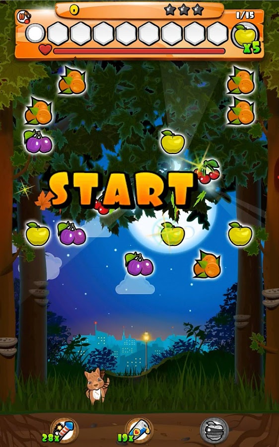
In the screen above, players can observe a clear separation of the visual elements.
Players see a section dedicated to the the ground, a rectangle between two trees showing a dirt road to the city and the space on top is dedicated to the branches and the leaves of the tree.
Through the creation of clearly identifiable patterns, the art of the game is of high quality, but players will not ignore the lack of diversity. While the game offers day/night cycles, this is not enough to maintain the visual novelty over hours of gameplay.
Conclusion: the game does lack diversity in its environments and the day/night cycles are an interesting feature, but do not compensate for the lack of art. Luckily, the few arts existent in this game were carefully crafted, remaining true to concepts of visual arts, thus ensuring an appealing experience.
It is true that quality should come before quantity, but it is paramount to find a balance. This games has not found it. It leans too much towards quality and leaves the quantity out of the equation.
Score: 7/10

Animations:
The job of an animator is to make a virtual character move in a fluid manner on screen, as opposed to leaving the impression that is has been moved by an external force.
In short, the role of the animator is to make a character behave in a way that appeals to the eyes of players.
In 1981, two Disney animators, Ollie Johnston and Frank Thomas, wrote the book The Illusion of Life: Disney Animation that details the principles used by Disney to achieve the best animation possible.
These rules are called the “12 basic principles of animation”. One of them is known as “squash and stretch”, which stands for the deformation of an object when either moving or receiving impact, as the image below shows.

The idea behind this principle is to use deformation to communicate impact or motion. But what does this have to do with this game? You may ask.
This technique from Disney is used with mastery in this game. When the squirrel players control hits the ground, it deforms, as the ball in the image above, thus communicating visually the impact with the ground.
What may seem as a small detail, has great influence on how the player perceives the game, as it delivers a more visually appealing experience.
The only problem with the animations of this game is how the squirrel does not deform upon hitting the sidewalls of the map.
It would have made for a better visual experience, if an animation was added in this moment, in order to better communicate the impact and the change of trajectory the animal undergoes upon hitting the walls.
Conclusion: small details can make a big difference and the developers of this game have certainly paid attention to how the animation of the character communicates motion and physics, through the use of the “squash and stretch” rule from Disney’s 12 basic principles of animation.
The only reason why I cannot give a perfect score for this game, regarding its animation, is the lack of visual feedback once the squirrel bounces on the walls of map.
Score: 9/10
Now that we have covered the visuals of the experience, it is time to talk about its gameplay mechanics and how it learned from another Match 3 game.
Game mechanics and finding inspiration in Candy Crush:
The video above from the YouTube channel Extra Credits analyzes how the mobile game Candy Crush became successful. One of the reasons pinpointed in the video is how levels in Candy Crush can vary between each other from a design perspective.
Adding level design to the equation, developers managed to create plenty of diversity in the game, thus evoking more interest in the players, who continued playing for many reasons, but one was the curiosity of wanting to know what the next level would look like.
Wild Furballs: Throw uses this to its advantage in two different ways.
1 – While the level design in itself does not change, the placement of the fruits vary constantly, leading players to wonder what the next arrangement will look like. Odds are they will continue playing to find out.
2 – In the image above, you can observe three icons in the bottom of the screen. One of them is black and white. In the beginning of the game, all of these three are in black and white.
These are powers players can use and the game unlocks them over time. Since the very first level, these icons are already there, but players cannot interact with them.
This adds curiosity to the experience, as many users will wonder what these buttons do, but to discover that, they need to continue playing. Many of them will.
The result is an experience, in which players are constantly wishing to play more, in order to find the pleasure of discovery.
Conclusion: as previously stated herein, the game mechanics are simple, but developers constantly add new variables as the player progresses through the game, thus ensuring that the experience remains novel.
This makes the players curious to continue playing, in order to discover what upcoming levels will look like.
The only downside is the aforementioned lack of diversity in the map. Considering that this game relies on physics, it would have been interesting to see maps with different shapes, as opposed to always being rectangular.
It would have been interesting to see a triangular map, for instance, which would alter the way the squirrel behaves, as the angle it hits the wall would be different from what the player is familiar with, thus adding more novelty to the gameplay.
Score: 8/10


Overall Conclusion:
In this game, players experience the unlikely combination of Candy Crush, Breakout and Angry Birds, with a solid visual experience, achieved through the art and the animation, whilst discovering new elements of an engaging game design.
This is a game that will certainly make hours go by quickly. The only major downside was the lack of diversity in the background art.
Scores
Tutorial: 8
Visual Experience: 7
Animations: 9
Gameplay mechanics: 8
And the overall score is…




Published: Feb 5, 2017 06:40 pm