Many of us are eagerly waiting for the Nintendo Switch, with just two more weeks to go until it launches. But a lucky someone in the public got his hardware two weeks early, and leaked the Switch OS in a video.
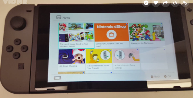
Neogaf user “hiphoptherobot” got his hands on the Switch early and showed off the UI and menus for the console. Up until this point, we didn’t know much about the UI except seeing some in the trailers. But this video goes more in-depth with the UI than anything we’ve seen, and answered a lot of questions that fans were asking.
So what did we learn?
You Will Definitely Need A Memory Upgrade
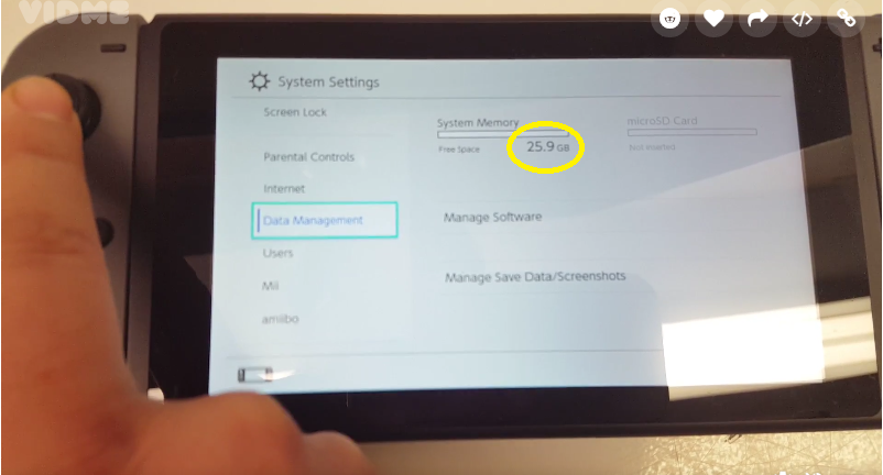
At the Switch reveal, Nintendo stated that the console will have 32GB of storage and will be able to support mini-SDXC cards. A lot of fans were worried about storage space, because many of them make digital purchases rather than opting for physical copies their games. And this video shows that they definitely have something to worry about.
It shows that the actual memory storage, after the installation of the UI, is a total of 25.9GB — not much at all. If you plan to get Breath of the Wild and opt for a digital download, then more than 50% of your onboard storage space will be used by its 13.4 GB file size. There won’t be many games we can download before we’ll have to upgrade to more memory.
Personalization Options are Limited
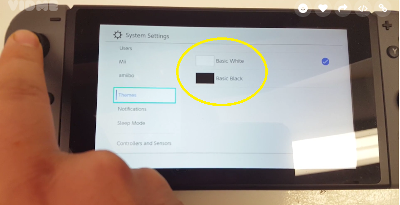
When I heard that the themes in the Switch’s UI can be changed, it got me thinking about how customizable I can make the UI to add my personal touch to the console experience. Though the leaked video didn’t show many options to change the UI, there was an option for a dark or light theme as the defaults settings.
It’s too bad that there isn’t much else to personalize, but I’m hopeful that Nintendo will add other fun and colorful themes in the future as more games launch and the console takes off.
The Main Menu is Clean (But Can We Customize?)
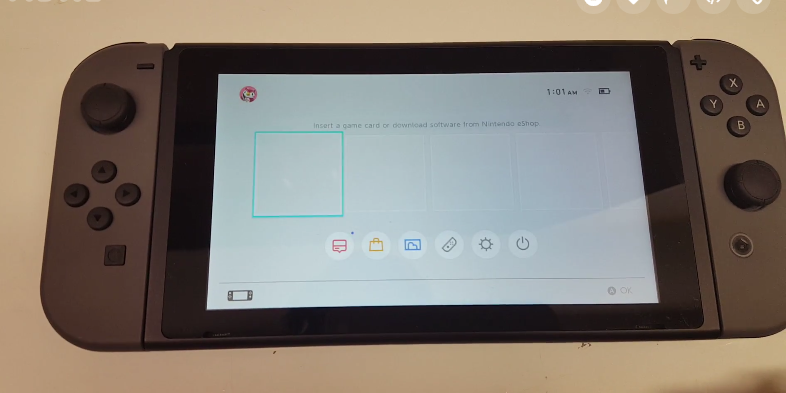
The main menu is where I will spend most of my time when I’m not in game. And I would love to be able to move applications and customize the main menu so it’s easier for me to navigate. The default main menu looks simple enough to use, but adding a personal touch can go a long way.
—
It’s crazy that we get to see the Switch UI for the first time like this, instead of Nintendo showing us how it works. Neogaf “hiphoptherobot” did everyone a favor with his video, we now know more about the Switch thanks to it.
Do you still have unanswered questions about the console? Let me know in the comments!

Published: Feb 16, 2017 04:57 pm