Last week during Sony's conference in Japan a demo was shown of the new randomly-generated RPG being produced by Capcom, Deep Down. The PS4-exclusive title looks to give a new life to the role-playing genre by having everything from dungeons, maps, weapons and even monsters being randomly generated. This will give each player a unique experience they can call their own.
Not much is currently known about the game except it is based around the ability to look into the past just by touching an object. This week Capcom’s Yoshinori Ono released several new screenshots for fans to enjoy. In this article I'll give my opinion on each one.
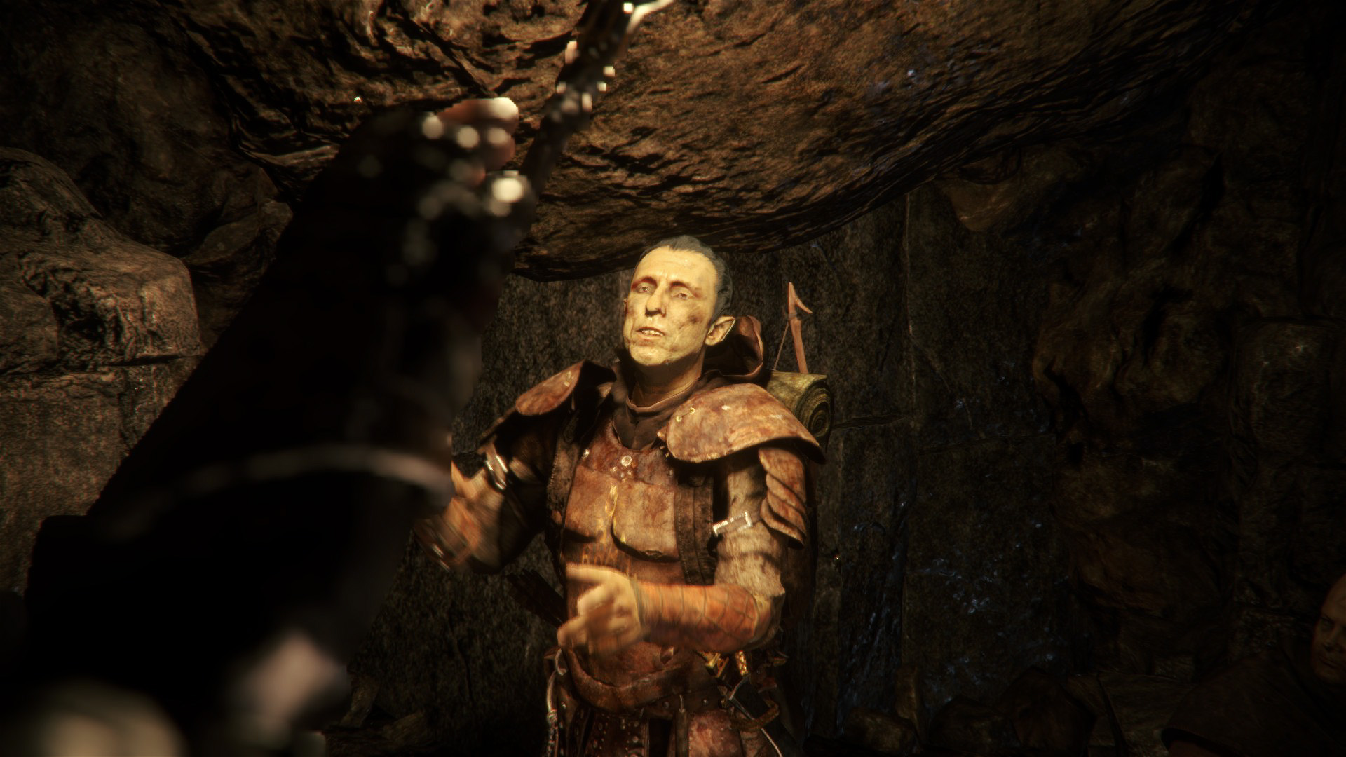
At first glance this might seem like some really nice graphics, but I noticed some pixelation on one of the fingers in the foreground. Also the armored person doesn't look all that realistic to me. His face looks a bit awkward. I'm not sure if it's supposed to be that way, but only time will tell.
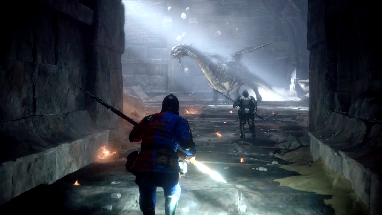
This image features the dragon that is shown in the video I added in slide one, as well as what appear to be soldiers or knights going to fight it. The lightning effects look pretty good but the concrete walls on the left and right side of the foreground look a bit odd to me. Also, the dragon doesn't look as detailed as in the video.
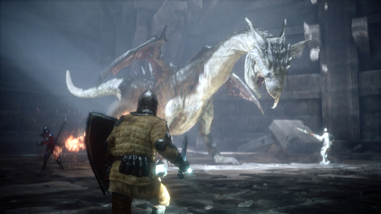
Another picture of the dragon in what looks to be a battle sequence. The lighting on the back of the character in the foreground doesn't look natural at all considering where the light source is and the way the light is shining on the dragon. The graphics however look rather good but I can still tell that it's a video game.
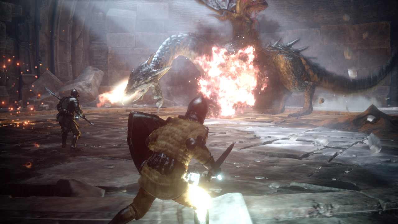
The last photo released shows the battle with the dragon yet again, but from a different angle. Once again, the lighting on the main character doesn't make sense to me at all. The fire effects look really nice but I think there probably should be a bit more smoke and ash.
All-in-all, I'd say the screenshots look different from the video. That's not to say that the game doesn't look good, to me it just looks like the game needs more work to be done. I do like the concept of the game so I will be looking forward to hearing more about it as news is released.
What are your thoughts? Do you agree or disagree with my findings? Let me know in the comments below!



Published: Sep 19, 2013 12:21 am