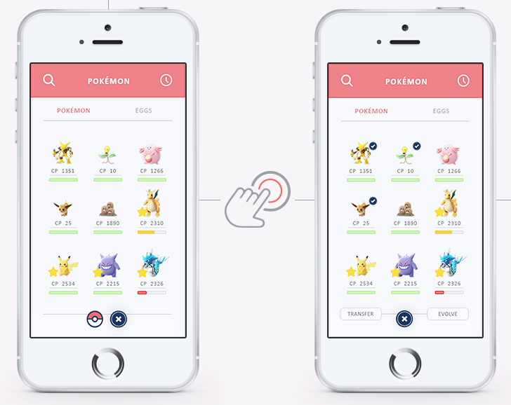
Dutch artist and Pokemon fan Wendy Borg has recently released a redesign of the infamous Pokemon Go user interface, giving it the well deserved overhaul it so desperately needs. Borg focused primarily on bringing back the competitive, exploration, and collecting features that brought the sense of fun and wonder to the previous Pokemon titles. Her Behance gallery re-imagines Pokemon Go as more aligned with the handheld titles with a solid idea of what it wants to be.
Building it from the ground up, the physicality of Borg’s design is minimalist, crisp, and sharp. Pokemon are visible within a 200 meter radius, allowing players a sense clarity they have not been offered in the original Pokemon Go. Ease of use, an issue in the original game, has been increased exponentially. Done through streamlining the inventory, pokemon, and egg screens making transferring or evolving creatures, in singles or groups, easy with only a few taps. Even the Pokedex has been refocused as intuitive and appealing rather than clunky UI players have been dealing with the past month.
It is obvious Borg put serious thought in redesigning Pokemon Go, rather than building it around a broken interface, giving the player an option to get more out of the game than they previously could. For example, pokestops, which are otherwise spammed every five or so minutes for items, are re-purposed as not only locations to stock up on items (to avoid paying actual money for virtual goods), but it also guides the player in the direction of rare pokemon that have been spotted in the vicinity. Pokestops also can grant access to certain items after conquering nearby gyms, and a timer if the same stop is used too often.
What sets this apart from the actual Pokemon Go is the creativity and thought that has gone into creating a more interactive and motivating play experience; one that gives the player an incentive to keep playing, rather than having to grind as much as possible to power up their pokemon only to maybe go on and conquer a gym or two.
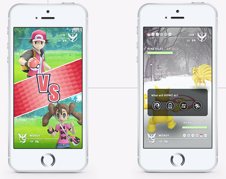
Rather than buying items in set amounts, the Pokemon Go UI redesign gives the option for only paying for the amount of items you need, much like the original Pokemart. But, more importantly, Borg touches on the premise that is the driving force behind Pokemon. The battle mechanic is central to any Pokemon game, and Pokemon Go‘s severe lack of any kind of interaction besides Gym battles has left players hoping for more. The new player profile would give trainers the ability to view their own statistics as well as their opponent’s. Trainer classes are also dependent on the team composition, which means that much like their pokemon, a trainer’s team and abilities will also evolve. Battle gym leaders would stay the same, but real time AR battles would be possible between friends or even a passerby.
By implementing a social feature into her redesign, Wendy Borg focuses on a chat feature that would allow teams, friends, or anyone nearby to share information about pokemon in the area or aid in coordinating battles. Multi-battling and trading would make a comeback as well, giving trainers the options to trade with friends, which in the bigger picture will be invaluable to players across the world who do not have access to certain pokemon. Borg has even had the foresight to add battery saving, and smart watch features, which appear to theoretically function better than their real counterparts.
If you would like to give Wendy Borg’s gallery a look, her full Behance gallery has many more images.






Published: Aug 10, 2016 11:59 am