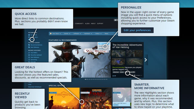
If you look at Steam right now, maybe you’ll notice that it looks a bit different. It’s the Discovery Update 2.0, which has given the front page of the digital store a facelift and some slight tweaks to how curators work in Steam’s ecosystem. The update has been implemented and users should be able to see it for themselves right now.
This front page refresh had been promised for quite a while, building on the improvements set forth by the first Discovery Update. It seems that it has done more than just make things look better. One of those major changes is requiring publishers to post real screenshots of games.
Pre-rendered screenshots (colloquially known as “bullshots”) and concept art had always been used to market games, and the practice had been under fire in recent years due to major releases that fell short of their promises made through pre-release marketing (i.e. Watch Dogs, Aliens: Colonial Marines, No Man’s Sky).
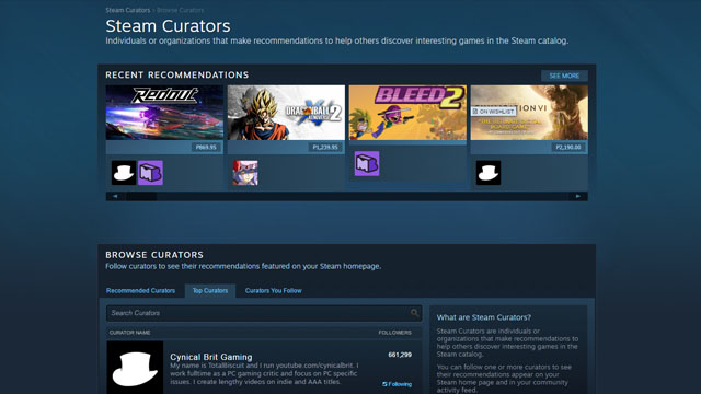
Steam Curator now has a new home page, wherein users can browse the curators’ recent reviews. Curators are now also given the ability to indicate whether they’re actually recommending a game or just providing information about it. Users can now better look to curators for recommendations and suggestions of games they can buy next.
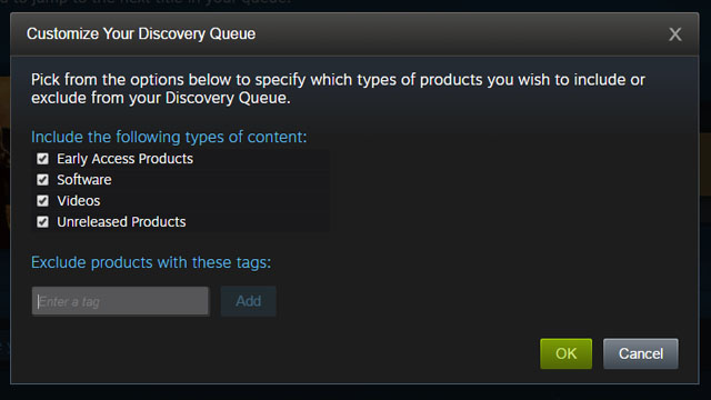
The Discovery Queue has been given customization options to make it better at giving users recommendations that are specific to their preferences. You can boil it down to specific genres, states of release, and even other media such as software and videos. With this update, it now matters even more to click “not interested” on something you’re not into.
Other changes included in this Discovery Update were implemented earlier, including fine-tuning the display of new releases, showing local top sellers, a new iteration of User Reviews for better reflection of game quality, and so on.
Steam’s front page used to be criticized for being a mess and unhelpful to indie developers whose games get buried by bigger releases and floods of other indie titles. Hopefully this new revamp, like the first Discovery Update, has made improvements on the look and feel of the Steam front end, and that Discovery 2.0 has added new and helpful features like the Discovery Queue and Steam Curators.









Published: Nov 9, 2016 02:14 pm