It hasn’t even been a day and people are already complaining about Civilization VI. What’s most irritating is the fact that these complaints aren’t aimed at gameplay or a long-time feature now abandoned; they’re aimed at the new colorful style — a style that’s somehow important enough to deem the game literally unplayable.


Among the sea of reactions to the recent announcement are a couple of comments poking fun at the comic-like overtone. People are whining about the game’s new look. And while I’d normally ignore these comments on behalf of stupidity and ignorance, a more concerning issue comes up:
Nobody seems to grasp the importance of clarity.
As the Civilization series grows and develops, one concept remains static and acts as one of the more defining features indicative of the game’s success: user-friendliness.
From each installment to the next, the UI continues to remain easy on our eyes.
Unlike other turn-based strategy games, Civilization is by far the most welcoming. A well-developed tutorial and a barrage of hints from advisers save us from spending hundreds of hours watching YouTube videos in the feeble attempt to make our daughter wed our bastard son. Sure, there are a ton of little tricks we learn even hundreds of hours in, but the basics seem to be correctly covered.
A problem I had with Civilization V was the overall tone. Mechanically, nothing was wrong. The game played as smooth as butter and I had fun building roads and expanding my empire. However, everything in the game just seemed to blend together, creating what I liked to describe as, “a large accumulation of brown poop.”

Truthfully, it doesn’t even look bad. It’s different from the realistic and gritty.
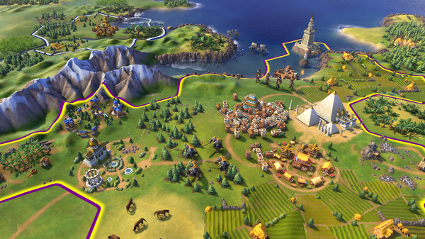
Colors were very neutral. Nothing stood out. It was rather difficult to pin point units or wonders in a city, and this got progressively harder as time went on. So if there was one thing that Civilization could do for, it would be a change of color — and that’s precisely where the new art style comes in.
Troops are everywhere. Every tile can be filled to the brim with unique buildings or units. And with a game as hectic as Civilization, it’s important to be able to differentiate between what’s what and who’s who.
With the new color scheme, everything seems to pop.
Wonders are now wonders, and their magnificence and glamour can be seen from tiles away. No longer do I have to click each enemy city to see which is the best one to capture. A simple glance can give me all the information I need to make my strike.

Yeah, because I played Civilization to sit back and adore the graphics.
People complain about the smallest things, but the new art style should not be one of them.
I picked up Civilization to manage cities and take over the world. If a new art style can help me differentiate between what is going on in battle, then I’m all for it. How about you?




Published: May 11, 2016 10:35 am