To claim that graphics form an integral part of gaming would be an understatement. We can all agree that graphics are one of the most important aspects any video game can have. They are one of the easiest selling points of a game, and only those that are truly exceptional in other areas can afford to, to an extent, ignore or neglect the visuals that every player will experience when playing their game.
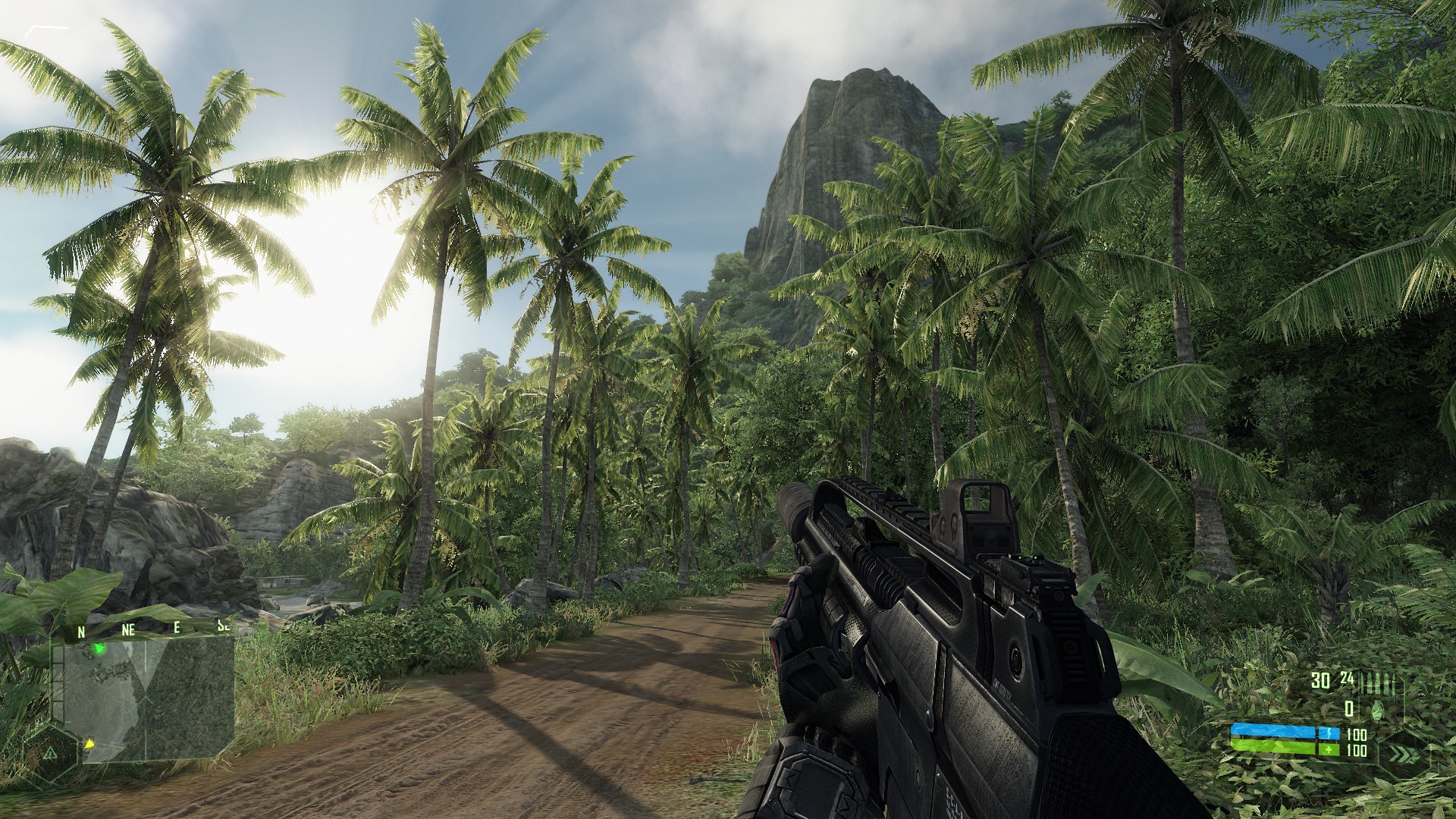
I can’t tell you exactly why graphics seem to play an important part, but I can speculate and guess. Perhaps it is because essentially every person who sees graphics seem to share the scale that judges what are good graphics and what are not. There are few out there that can objectively challenge the idea that back in 2007 when Crysis was released, the level of detail and visual richness the game had was simply amazing and until then unparalleled. Since we all live in reality, it makes sense that our assessment of how virtual machines represent it seems to be standardized and shared by the vast majority. Even people who aren’t gamers can easily make similar assessments and, will more likely than not, agree over what games look better than others.
It might not look like that much today, but Crysis is already a 10-year-old title.
But alas, graphics are not everything, and while games like Crysis definitely left a mark in the gaming industry, it certainly did not go beyond the eye-candy it provided. I’d even say that every other aspect of the game was average for the most part. DICE is now guilty of following this trend evermore since it started using its famous Frostbite engine.
Perhaps to even a greater extent than the CryEngine did, Frostbite seems to be easily one of the most recognizable engines out there and for a good reason: the level of details and effects is simply gorgeous. Much like Crysis, no matter how uninterested you might be in the Battlefield or Battlefront franchises themselves, there’s no denying they look pretty damn impressive. Perhaps too impressive.
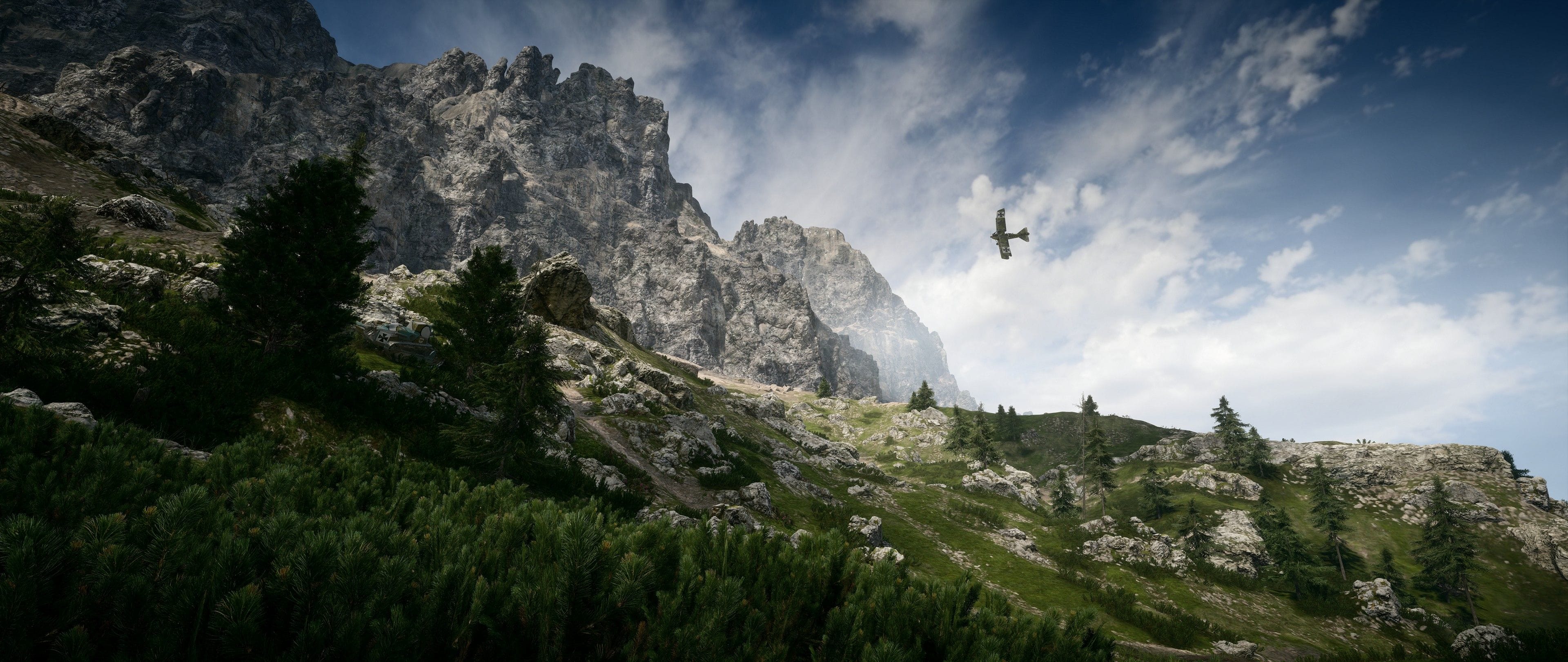
Battlefield 1 is one of the latest titles to make use of Frostbite.
As stunning as the explosions, physics, shadows, and particle effects may be, the merit of the hard work put into some of these areas by creating a constant show-off of them on screen seems to undermine that work. If you’ve played any of the recent Battlefield or Battlefront titles, stating that “quite a few things are going on at the same time” would be selling it short. Maybe I’m just getting older, or maybe the Tranformers movie franchise took a heavier psychological toll than I initially thought, but the amount of incessant explosions, rocks, smoke, lasers and whatnot occurring at the same time with the Frostbite engine seems like a misuse. There are two reasons for which this seems like an abuse of the engine.
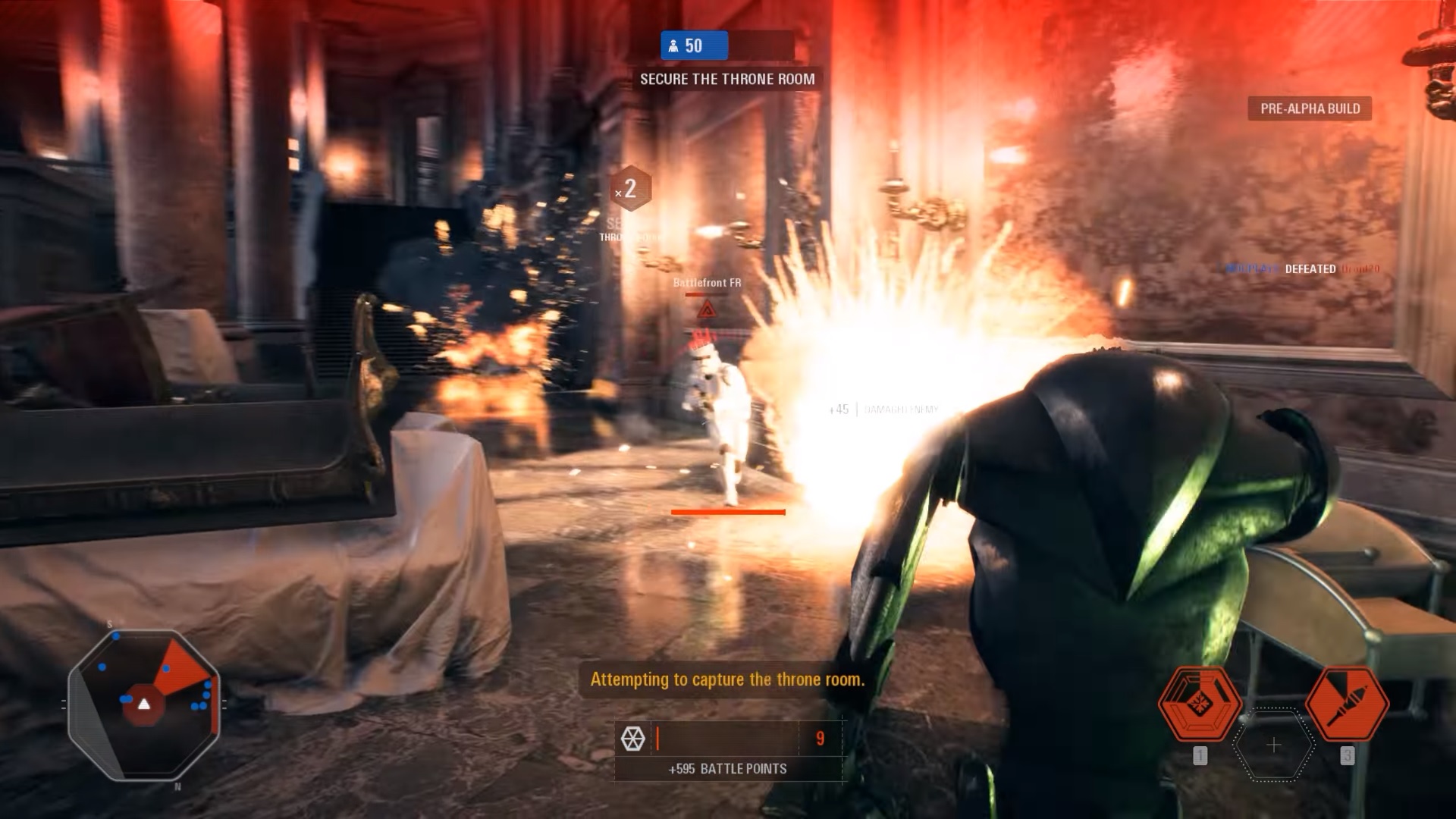
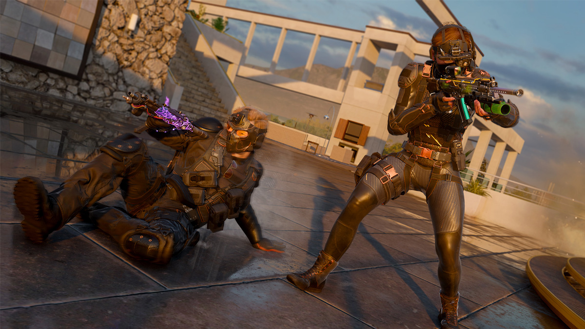
Battlefront 2 and Frostbite in action.
First, by constantly displaying what Frostbite is capable of, DICE reduces the “Wow” and shock factor each time. Much like real world appreciation, the more easily something becomes available, the less value it tends have. If diamonds or gold were as accessible as iron, chances are we wouldn’t have either on engagement rings that cost thousands of dollars.
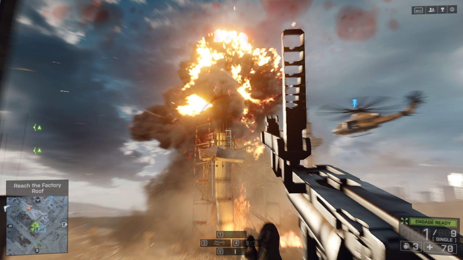
DICE tends to cluster as much as possible what players see with nonstop effects. It reduces the impact and appreciation it has on the player. The first time we saw that sky scraper collapse in Battlefield 4, it was amazing. The 50th time was far less amusing. However, because such type of animations are so limited, they retain their awe longer. The same logic should be applied for some of animations that are used much more often.
When everything that can explode, will explode.
The second reason is it serves as a smokescreen for game design flaws that are only made evident once you’ve played the game enough time. These are aspects that are harder to notice tend to be perceived mostly by players who either put enough hours into the game and/or can easily compare them to other titles they’ve played.
Captivated by all that eye-candy, it distracts the player from noticing other flaws, and only after they have become more accustomed to all those visuals do they start to pick up on others aspects that are equally important to the overall experience. Level design, game modes, classes, balances, vehicles and whatnot each play their part in the player’s experience.
The flaws (or strengths) are only made obvious after the game has been sold, unlike the graphics area where it can be appreciated without ever touching the game. This hinders an effective patching process and whatever future titles the studio works on. Unless the game design flaws are so defective or outrageous that the prospective playerbase reacts to them. Usually by some combination of anonymous individuals who analyse the flaw, effectively explain it, and is picked up by the online community and gets enough traction. The clear example of this would be EA’s gambling scheme set up in Battlefront II (2017).
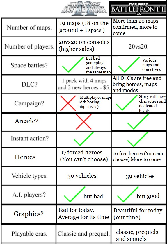
While making progress in the graphics department, game design improvement has been more neglected.
This piece is not advocating for a downgrade in graphics justified by more awareness put into the non-visual departments. Progress in visual development will be welcomed to the point we can’t tell the difference between what’s real and what isn’t. What it is advocating for is a more mindful approach to how graphics are used.
When every single building becomes destructible resulting in a cloud of dust, every shot impact results in an explosion of sparkles cluttering the screen or when lens flare is present at all times, it just ends up feeling like a Michael Bay movie. This doesn’t mean there isn’t a market or genre where such things can and should be over the top, but it doesn’t seem quite to fit the more serious tone that games like Battlefield or Battlefront seemingly attempt to achieve. Some effects and visual features can be more effective when used surgically than at every possible opportunity.

Michael Bay Paper Bags Inc.
Agree? Disagree? Leave a comment below.





Published: Feb 23, 2018 03:01 pm