Last week, The Pokemon Company released the first trailer for Pokemon Sun and Moon, and with it came our first looks at the tropical Alola region. We also got to see the starter Pokemon for Generation 7 for the first time, and did they get popular quick! Fans have been trying their best to guess what these three cuties will look like in their final forms, so we’ve compiled a list of some of the best fan artwork of these “Fakemon” just for you!
Let’s take a look at some of the conjurations the fans have come up with, shall we?
Sun and Moon starter evolutions by Jota769
This first set of the Sun and Moon starter evolutions come from Reddit user Jota769. In this evolution line Rowlet keeps its Grass/Fighting combination, Popplio turns into a Water/Ice dual-type, and Litten appears to stay as a mono Fire type.
While these designs are interesting, a key issue can be found in Popplio’s design. Dewgong and Walrein have already occupied this spot for some time so another Water/Ice seal Pokemon is unlikely.
As for the others: Rowlet’s final evolution looks very Pokemon-esque and keeps its original typing. Meanwhile, Litten’s evolution seems a little out of place among the three. Overall, not a bad attempt.
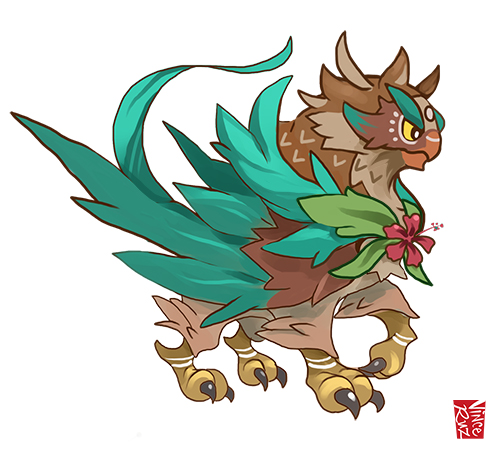
Rowlet Evolution Concept by vinciruz
Vinciruz’s evolution concept for Rowlet goes in an interesting direction. Instead of staying with the owl motif, Vinciruz goes above and beyond into gryphon territory. While he does stick with the Hawaiian theme, this Rowlet evolution interpretation has a couple of noticeable flaws.
The first one is obvious to most Pokemon veterans, that being the fact that this evolution has far too much detail for a Pokemon design. While some Pokemon in the fourth generation did get pretty complex, the art style has been returning to its roots in base colors and simplicity.
The second is that the evolution is hard to recognize from its original form. An overwhelming majority of Pokemon typically stick to a certain creature type as they evolve. An owl turning into a gryphon is a bit farfetch’d. Then again, Samurott did surprise us in Generation 5.
Nevertheless, it’s a fun design that will put some wind under the wings of gryphon Pokemon hopefuls.
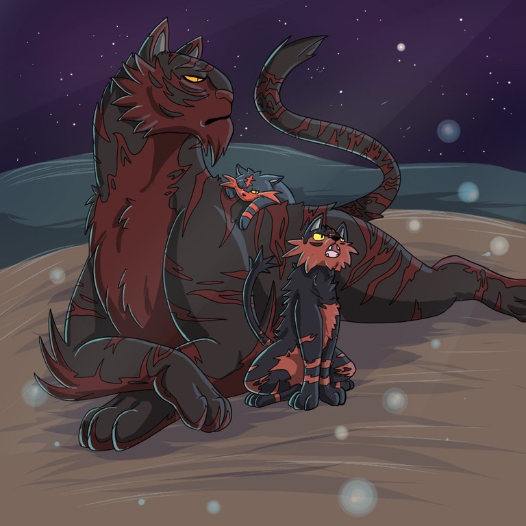
Litten evolution by REBioHazard
Many fans have come up with tiger-like designs for Litten’s evolutionary line, and this artwork by REBioHazard shows the potential of the full line. It appears to have tkane some inspiration from the Charizard line of evolutions. In this evolutionary chain, Litten slowly moves from cute, to angry, until it is poised at the end of the chain.
The only issue with this evolution chain is that REBioHazard appears to have forgotten the most important element: fire. Otherwise, the art style for the two Fakemon in this image could certainly make the transition into a Pokemon game, provided that the level of detail (particularly on the final evolution) is toned down a bit.
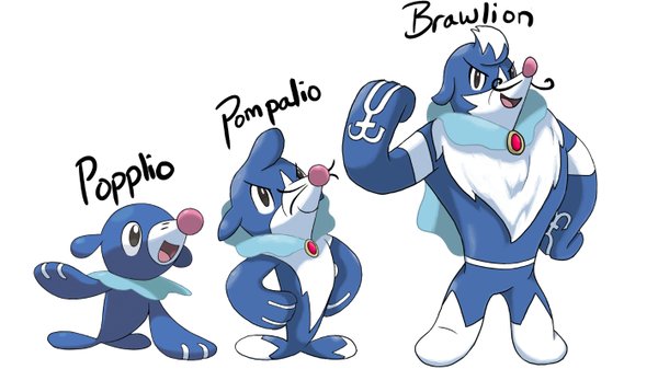
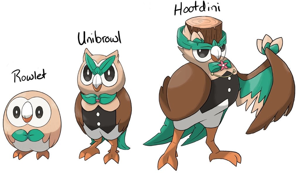
Gen 7 grass and water starter evolution concept by Lupus
These two starter designs by @LupusImmortal are perhaps some of the most believable so far. By using the original starter Pokemon concepts as a base, and the fan-deduced “Circus Act” theme among the Sun and Moon starters, Lupus came up with the Magician Hootdini, and the Strongman Brawlion.
Both are quite interesting designs, and the type combinations are certainly noteworthy. Depending on if Hootdini is Grass/Psychic or Grass/Flying, it could suggest all three starters have two type advantages over each other or that they share both a reverse triangle and a typical type advantage triangle. If the former is the case, would Litten’s final evolution be Fire/Dark?
Whatever the case, Lupus’s designs are certainly a personal favorite for being true to the Pokemon art style, as well as bringing in some interesting ideas.
Fake Alola evolution designs (Source Unknown)
These three evolution designs found by Reddit user IanMazgelis supposedly originated on 4chan and have been constantly shot down as fake.
The designs are certainly interesting to look at; however, Popplio and Rowlet’s final evolutions being so nightmarish defeats any possibility at a realistic prediction. Tack on top of that the sleek design of Litten’s final evolution and it is unlikely that any of these will ever see the daylight as true Pokemon characters.
The secondary evolution for Rowlet at the bottom does seem quite in-character for the series, though. Could it have possibly been another 4Chan leak in disguise as a fake Pokemon post? Only time will tell…
Litten Final Evolution Fanart by DevilDman
Returning to the realm of possible true concepts, DevilDman’s Litten concept is drawn in true Ken Sugimori style. In fact, if this was posted on the cover of a Nintendo news article, then it would successfully pass as real concept art. From the simplistic design, to the choice of colors, and even the patterns on the fur, this Litten evolution is the most realistic yet.
DevilDman’s design suggests a mono Fire type, which is a bit bland in retrospect. However, the Pokemon series hasn’t seen a mono-Fire starter since Johto. Could this concept be a look at the return of mono-type starters? Sadly, no, as Rowlet already destroyed that possibility. It’s a cool thought though.
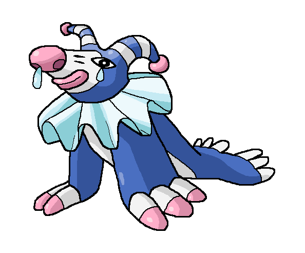
“Worst Case Scenario for Popplio” by DeepFriedYogurt
Worst case scenario is right on the money when it comes to DeepFriedYogurt’s final evolution design for Popplio. While the color and overall design does seem like something possible (provided a bit more of an ‘anime’ touch), a desireable Pokemon this is not.
Who caused you to go through such pain, Popplio? Why do people insist on making you the butt of all the seventh generation Pokemon jokes? Hopefully this design never comes into fruition as the final concept for poor little Popplio.
We saved the best for last!
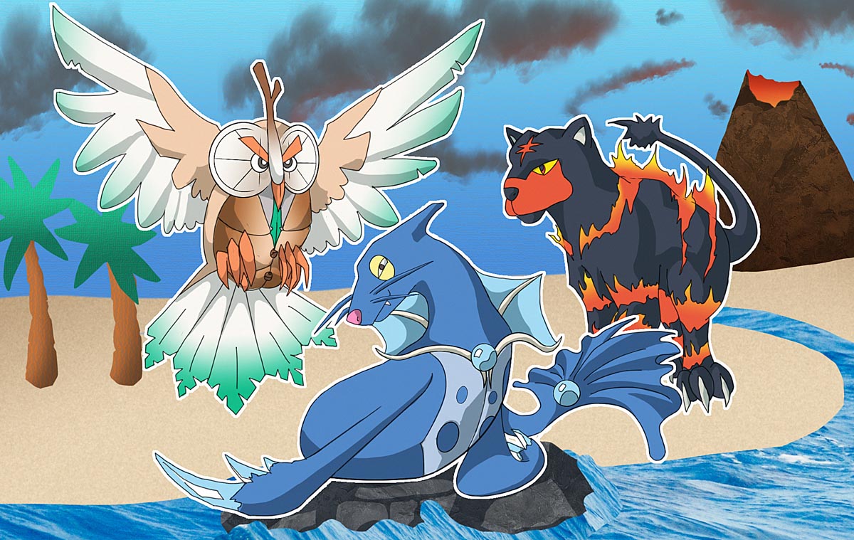
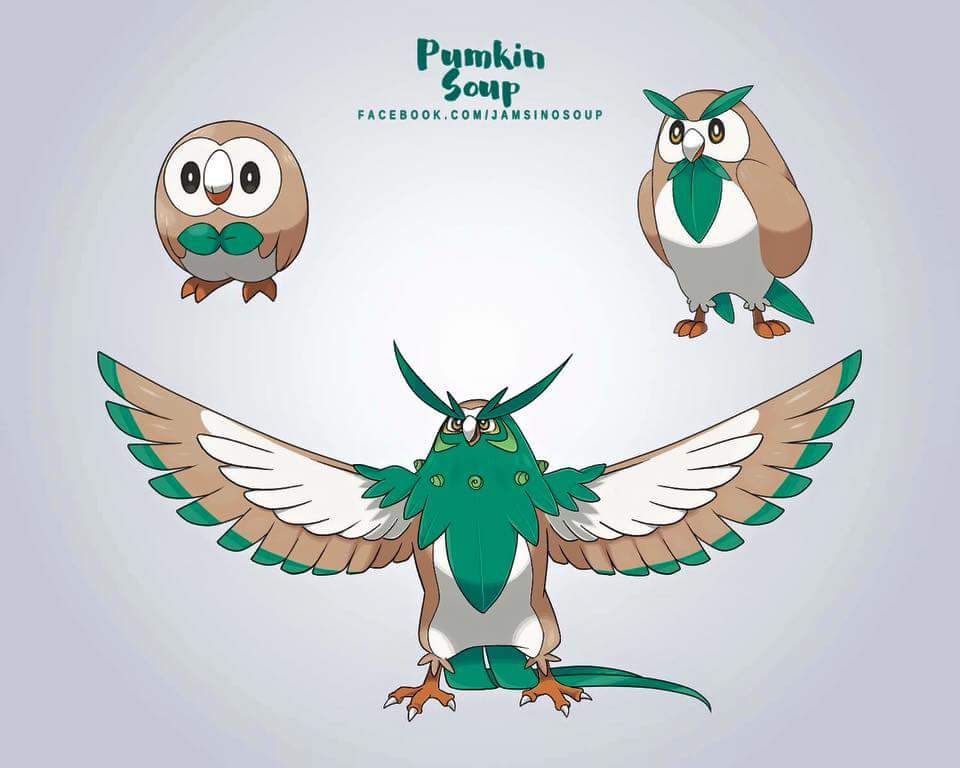
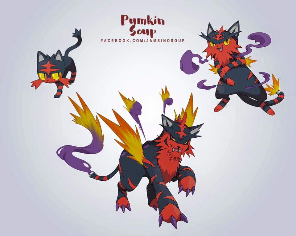
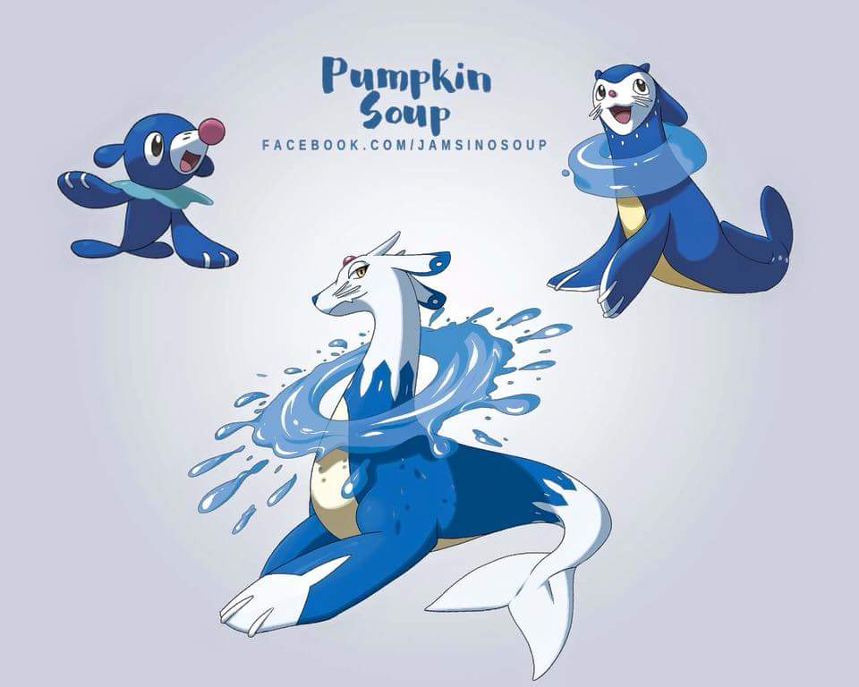
Just like DevilDman’s Litten concept, Pumpkin Soup’s designs take after Ken Sugimori’s art style in the best possible way. Each Fakemon looks like it could be a very real evolution, and they all have interesting details.
Pumpkin Soup (otherwise known as Andrea) kept it simple with Rowlet’s evolutionary chain. As Rowlet evolves in her interpretation, the Pokemon naturally grows more greenery on its body, similar to many grass-type starters in the past. It also seems to share some design inspirations from Pokemon such as Pidgeot, Hoothoot, and more. The final result is something that truly feels like a Pokemon design.
It’s certainly a better Grass/Flying design than Tropius at least.
The Litten line by Pumpkin Soup is also quite interesting. From the looks of it, Pumpkin Soup decided to give Litten a Fire/Poison type mixture – something that hasn’t been done in the series so far. It certainly looks edgy, something characteristic of Fire type designs as well.
If Litten does turn out to be a Fire/Poison mix, I hope that it looks something like this. It might actually get me over my aversion of cats…
Andrea really pulled all the stops with Popplio’s evolution designs. According to the Facebook post, this design is a Water/Dragon type, mostly out of spite of Popplio haters. If this is anything like the real evolutions then I doubt the haters will last too long.
In this design we can see some inspiration from Pokemon like Buizel and Milotic, namely in the water ring around its neck, and the majestic nature of the third evolution. It’s certainly a design that deserves to be paid attention to. However, I would maybe criticize that it went a little too far as it feels out of place among the other two.
Still, looks cool nevertheless.
What did you think of these Fakemon designs? Do you have ideas of what you think the evolutions will look like? Leave your thoughts in the comments section below!




Published: May 16, 2016 03:01 pm